World Population by Income Choropleth with animint
Kevin
Bob Rudis published a post last week using ggplot2 to reproduce an interactive visualization from Poynter. And he conveniently put all his code into a gist so that we can reproduce it. See here for why I'm using RCurl.
library(RCurl)
    eval( expr =
        parse( text = getURL("https://gist.githubusercontent.com/hrbrmstr/5a9a0d93cbb54f8ce777/raw/40b1573032df9c14cc65e18d1b783acd0fe6f3a1/poynter-income-choropleth-facets.R",
                       ssl.verifypeer=FALSE) ))
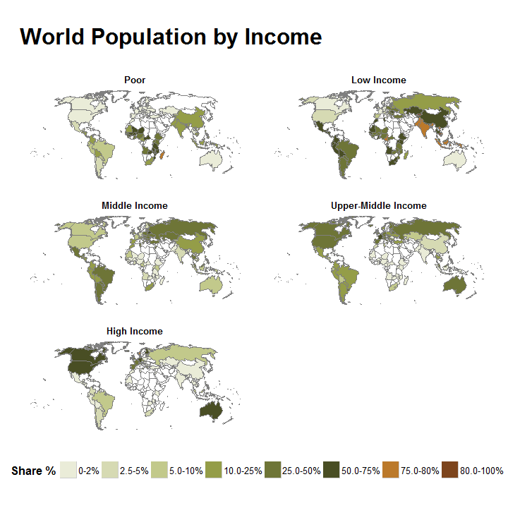
animint uses ggplot2 plots to create animated and interactive web graphics so we can use animint to extend Bob's plot. First, we have to make a couple of small changes to the previous code. geom_map() does not currently work with animint, so we have to merge the world_map and share_dat datasets then draw polygons for each country. I'll also remove the coord_equal() and modify the theme(legend.position = "bottom") lines because they don't render as nicely in animint.
share_dat2 <- world_map %>%
  rename(name = id) %>%
  inner_join(share_dat) %>%
  tbl_df()

gg <- ggplot()
## drawing the country outlines with geom_polygon
gg <- gg + geom_polygon(data=world_map,
                        aes(x=long, y=lat, group=group),
                        color="#7f7f7f", fill="white", size=0.15)

## updating styles and themes - taken from Bob's code
gg <- gg + scale_fill_manual(values=share_pal)
gg <- gg + guides(fill=guide_legend(override.aes=list(colour=NA)))
gg <- gg + labs(title="World Population by Income\n")
# gg <- gg + coord_equal()
gg <- gg + theme_map()
gg <- gg + theme(panel.margin=unit(1, "lines"))
gg <- gg + theme(plot.title=element_text(face="bold", hjust=0, size=24))
gg <- gg + theme(legend.title=element_text(face="bold", hjust=0, size=12))
gg <- gg + theme(legend.text=element_text(size=10))
gg <- gg + theme(strip.text=element_text(face="bold", size=10))
gg <- gg + theme(strip.background=element_blank())
gg <- gg + theme(legend.position="right")  ## modified from the original

## I'm going to remove facet_wrap shortly, so I'll create a new object
gg2 <- gg + facet_wrap(~label, ncol=2)

## it's the same plot, we just drew it in a different manner
gg2 +
  ## drawing polygons for Share for each country
  geom_polygon(data=share_dat2,
               aes(x=long, y=lat, group=group, fill=`Share %`),
               color="#7f7f7f", size=0.15) +
  theme(legend.position="bottom")  ## so the basic plot looks the same
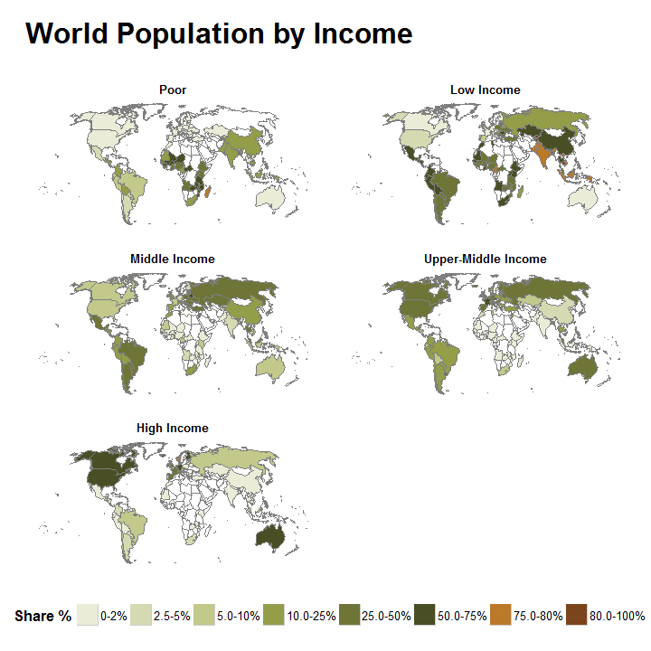
Because animint creates web graphics, we can easily add some interactivity to this plot. For example, we can add a clickSelects aesthetic to link countries across the facets. Try clicking on the different countries in the plot below.
library(animint)
## printing with animint
viz <- list(map = gg2 +
              geom_polygon(data=share_dat2,
                           aes(x=long, y=lat, group=group, fill=`Share %`,
                               clickSelects = group), ## animint part!
                           color="#7f7f7f", size=0.15))
structure(viz, class = "animint")
Animint plots are drawn using JavaScript so we don't need to use facets to display all the different income groups. Instead we can toggle between the different groups. To do so, I'll create two plots: the map on the left and text labels to toggle with on the right.
## drawing the map
gg3 <- gg +
  geom_polygon(data=share_dat2,
               aes(x=long, y=lat, group=group, fill=`Share %`,
                   showSelected = label), ## only show selected income
               color="#7f7f7f", size=0.15)

## drawing the text labels
label_dat <- data.frame(x = 1, y = 1:5, label = unique(share_dat2$label))
incomes <- ggplot() +
  geom_text(aes(x = x, y = y, label = label,
                clickSelects = label), ## used to select the group
            data = label_dat, colour = "red") +
  scale_x_continuous(name = "", breaks = 1, labels = "") +
  scale_y_continuous(name = "", breaks = NULL) +
  ggtitle("Select Income\n") +
  theme_bw() +
  theme(panel.border = element_blank(),
        panel.grid.major = element_blank(),
        axis.ticks.x = element_blank())

## visualization of both plots
viz <- list(map = gg3 + theme_animint(height = 500, width = 500),
            labels = incomes + theme_animint(height = 500, width = 150)
            )
structure(viz, class = "animint")
At the end of his post, Bob encouraged readers to try making a similar map that shows the percent change from 2001 to 2011 (just toggle the data on the Poynter plot to see the different plots). Again, let's do this using animint to make it interactive. First, we need to extract the percentage data modifying Bob's code just slightly.
## data_frame of percent changes
dat %>%
  gather(change, value, starts_with("Change"), -name, -id) %>%
  select(-starts_with("Share")) %>%
  mutate(change=factor(stri_trans_totitle(str_match(change, "Change ([[:alpha:]- ]+),")[,2]),
                      c("Poor", "Low Income", "Middle Income", "Upper-Middle Income", "High Income"),
                      ordered=TRUE)) -> change_dat
Then we need to set up Poynter's color scale.
## use same "cuts" as poynter
poynter_scale_breaks_change <- c(-100, -20, -10, -2.5, -1, 0, 1, 2.5, 10, 20, 100)
## make some nice labels
sprintf("%2.1f-%s", poynter_scale_breaks_change, percent(lead(poynter_scale_breaks_change/100))) %>%
  stri_replace_all_regex(c("^0.0", "-NA%"), c("0", "%"), vectorize_all=FALSE) %>%
  head(-1) -> breaks_labels_change

## add a % Change column
change_dat %>%
  mutate(`% Change`=cut(value,
                       poynter_scale_breaks_change/100,
                       breaks_labels_change))-> change_dat

## Poynter's colors
change_pal <- c("#7C441C", "#9E7F2D", "#E4CB83", "#F6EED6", "#E6E7E8", "#E6E7E8", "#D5FFE9", "#82A6BF", "#335062", "#916E99")
A little bit more data manipulation to combine the change_dat and world_map datasets.
## merge change_dat with world_map
change_dat2 <- world_map %>%
  rename(name = id) %>%
  inner_join(change_dat) %>%
  tbl_df()
And now we are ready to plot. We just have to pass in the updated color values and then add our new polygons on top of the plot.
gg4 <- gg +
  scale_fill_manual(values = change_pal) +
  geom_polygon(data=change_dat2,
               aes(x=long, y=lat, group=group, fill=`% Change`,
                   showSelected = change),
               color="#7f7f7f", size=0.15)
viz <- list(map = gg4 + theme_animint(height = 500, width = 500),
            labels = incomes + theme_animint(height = 500, width = 150)
            )
structure(viz, class = "animint")
Thanks to Bob for the inspiration!