Visualizing Pirate Attacks in R
Kevin
Animint is an R package which allows users to make animated and interactive web graphics from ggplot2 plots. To get started, follow the installation instructions in the README.
In this example, we'll use animint to visualize pirate attacks over the last 20 years. Below is an image of the visualization we'll end up with. Click on it to see a live version.
Pirates Data
To begin, we will need the coordinates of pirate attacks which are located in the animint package. These data come from the National Geospatial-Intelligence Agency. The data contain latitude and longitude coordinates for pirate attacks from 1978 to 2013.
library(animint)
data(pirates)
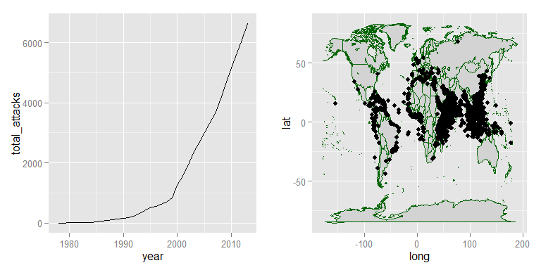
The coords.x1 and coords.x2 columns correspond to longitude and latitude coordinates respectively. Using typical ggplot2 graphs we might make a plot of the locations of these attacks.
# obtaining data.frame of country borders
library(maps)
countries <- map_data("world")

# plotting locations on world map with ggplot2
p_world <- ggplot() +
  geom_polygon(aes(x = long, y = lat, group = group), data = countries,
               fill = "lightgrey", colour = "darkgreen") +
  geom_point(aes(x = coords.x1, y = coords.x2),
             data = pirates)
Then we could make a plot of the cumulative number of attacks from 1978 to 2013.
# total attacks over time with some help from dplyr and lubridate
library(lubridate)  ## for working with dates
library(dplyr)      ## for data manipulation
# aggregating attacks by year then summing number of attacks
by_year <- pirates %>%
  tbl_df() %>%
  mutate(date = ymd(DateOfOcc),
         year = year(date)) %>%
  group_by(year) %>%
  summarise(attacks = n()) %>%
  ungroup() %>%
  mutate(total_attacks = cumsum(attacks))
# plotting cumulative attacks
p_time <- ggplot() +
  geom_line(aes(year, total_attacks), data = by_year)
And then we could plot these two simultaneously.
library(gridExtra)
grid.arrange(p_time, p_world, ncol = 2)
Animating with Animint
Using animint, we can animate this visualization over time. And it only requires a couple of very simple modifications to our original plots!
First, we'll need to modify the pirates dataset to add a year column.
pirates <- pirates %>%
  mutate(year = year(ymd(DateOfOcc)))
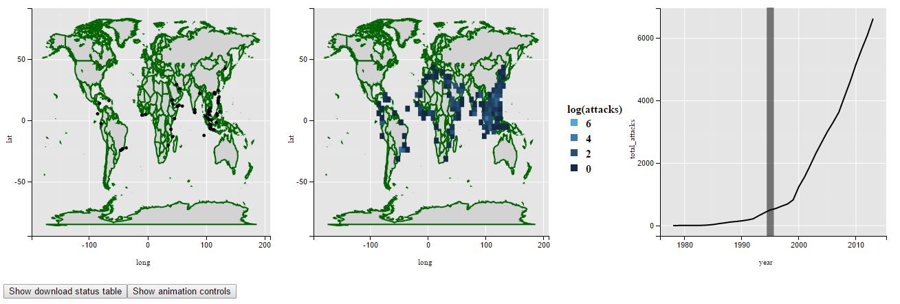
Then we recreate the world map graphic with one slight tweak. We'll add a showSelected aesthetic. Animint will see this and only show points in an individual year.
a_world <- ggplot() +
  geom_polygon(aes(x = long, y = lat, group = group), data = countries,
               fill = "lightgrey", colour = "darkgreen") +
  geom_point(aes(x = coords.x1, y = coords.x2,
                 showSelected = year),   ## this part is new!
             data = pirates)
To animate through the years, we'll add one line of code to the time series plot as well. Adding make_tallrect() will create a vertical rectangle in the background of the plot that loops through the years.
a_time <- ggplot() +
  geom_line(aes(year, total_attacks), data = by_year) +
  make_tallrect(by_year, "year")        ## this part is new!
To pass these plots to animint, we create a named list of the ggplots and additional plot options. Now we're ready to go!
viz <- list(world = a_world,
            timeSeries = a_time,
            time = list(variable = "year", ms = 300))
# to print in knitr, use structure(mylist, class = "animint")
structure(viz, class = "animint")
Adding a Heatmap
Heatmaps are cool! And ggplot2 makes them incredibly easy.
ggplot() +
  geom_polygon(aes(x = long, y = lat, group = group), data = countries,
               fill = "lightgrey", colour = "darkgreen") +
  geom_bin2d(aes(x = coords.x1, y = coords.x2), alpha = I(.8),
             data = pirates)
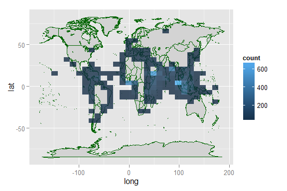
From this graphic, it appears that coasts of Liberia, Thailand, Somalia, and Eastern India have been hit hardest by pirate attacks. But we don't know when these attacks occurred. For that we can turn to animint.
2D Binning with Animint
The binning is a bit more complicated for animint unfortunately. Because we are iterating over time, we have to calculate the bins manually rather than relying on ggplot2's built-in functions.
The data manipulation code is kind of a pain, so I'm just going to put it all here. Feel free to jump past this, or post in the comments if you're interested.
# generates the bins needed for 2d binning
bin_2d <- function(x, y, xbins, ybins) {

  # binwidths
  x_width <- diff(range(x)) / xbins
  y_width <- diff(range(y)) / ybins
  # cutpoints
  x_cuts <- seq(min(x), max(x), by = x_width)
  y_cuts <- seq(min(y), max(y), by = y_width)

  # setting up all the bins
  x_bins <- interaction(x_cuts[-length(x_cuts)], x_cuts[-1], sep = "_")
  y_bins <- interaction(y_cuts[-length(y_cuts)], y_cuts[-1], sep = "_")
  bins <- expand.grid(x_bins, y_bins)

  # breaking into columns for x and y lower and upper points
  x_bins2 <- t(sapply(bins$Var1, function(z) str_split(z, "_")[[1]] ))
  y_bins2 <- t(sapply(bins$Var2, function(z) str_split(z, "_")[[1]] ))
  bins <- data.frame(x_low = as.numeric(x_bins2[, 1]),
                     x_hi = as.numeric(x_bins2[, 2]),
                     y_low = as.numeric(y_bins2[, 1]),
                     y_hi = as.numeric(y_bins2[, 2]))
  # identifying mean of each bin
  bins$xmid <- (bins$x_low + bins$x_hi) / 2
  bins$ymid <- (bins$y_low + bins$y_hi) / 2
  bins
}
## generating tiles
library(stringr)
bin_df <- bin_2d(pirates$coords.x1, pirates$coords.x2, 60, 30) %>%
  mutate(id = 1:nrow(.)) ## adding a unique id for each bin

# counts the number of points in each 2d bin
# double counting points on boundary (not worried about this)
count_bins <- function(bins, x, y) {
  bins$count <- apply(bins, 1, function(z) {
    mean(x >= z[1] & x <= z[2] & y >= z[3] & y <= z[4]) * length(x)
  })
  subset(bins, select = c(xmid, ymid, count))
}
# counting attacks in each tile in each year
d <- pirates %>%
  select(year, coords.x1, coords.x2) %>%
  group_by(year) %>%
  do(count = count_bins(bin_df, .$coords.x1, .$coords.x2))

## merging dates and counts
## should figure out how to do this with dplyr
l <- list()
for(i in 1:nrow(d)) {
  l[[i]] <- d$count[[i]]
  l[[i]]$year <- d$year[i]
}

# unnesting the list and counting total attacks
library(tidyr)
pirate_tiles <- l %>%
  unnest() %>%
  arrange(year, xmid, ymid) %>%
  group_by(xmid, ymid) %>%
  mutate(attacks = cumsum(count)) %>%
  ungroup() %>%
  filter(attacks > 0) %>%
  # join with bin_df to add an id column
  inner_join(select(bin_df, xmid, ymid, id))
Whew ... we made it.
Now we just have to create the plot with tiles, and add it to the list of plots. The resulting visualization is better viewed in another tab so just click on the screenshot to see a live visualization.
a_tiles <- ggplot() +
  geom_polygon(aes(long, lat, group = group),
               data = countries, fill = "lightgrey", colour = "darkgreen") +
  geom_tile(aes(xmid, ymid, fill = log(attacks),
                showSelected = year),  ## only show tiles in selected year
            data = pirate_tiles)
viz <- list(world = a_world,
            tiles = a_tiles,
            timeSeries = a_time,
            time = list(variable = "year", ms = 300))
Change for Each Tile
Finally we should add a graph showing how attacks accumulate in each tile over time. A typical plot, like the one below, would probably show all 1000 tiles, but this is noisy and not very informative. Animint allows us to only select certain tiles to view.
ggplot() +
  geom_line(aes(year, log(attacks), group = id),
            data = pirate_tiles)

First we'll update the tile plot so that we can select tiles by clicking them.
a_tiles <- ggplot() +
  geom_polygon(aes(long, lat, group = group),
               data = countries, fill = "lightgrey", colour = "darkgreen") +
  geom_tile(aes(xmid, ymid, fill = log(attacks),
                showSelected = year, # show tiles by year
                clickSelects = id),  # click a tile to select it
            data = pirate_tiles)
Then we plot the tiles over time, only showing the ones that have been clicked.
a_tile_time <- ggplot() +
  make_tallrect(pirates, "year") +
  geom_line(aes(year, log(attacks), group = id,
                showSelected = id), # only show tiles that have been clicked
            data = pirate_tiles)
Then we just update the animint visualization. Click on the screen shot to view a live example.
viz <- list(world = a_world,
            tiles = a_tiles,
            timeSeries = a_time,
            tileTimeSeries = a_tile_time,
            time = list(variable = "year", ms = 300),
            selector.types = list(id = "multiple"), # can select multiple tiles
            first = list(id = 767))

Cleaning up the Plots
Now that we have the basic visualizations set up, we just need some polishing and they will be ready to go. Here are the updates that I'll make
- remove grid lines and axes, and add a light blue background to the maps using
theme() - use
theme_bw()for time plots - use
size = I(1)to make country borders look nicer - clean up axis labels on time plots, remove them from maps
- use
make_text()to add the year to the maps - use
geom_text()to add a label to the selected tiles in both the world map and time plots; for the time plot, I create a new data.frame with the location of each label - use
scale_fill_gradient()to make the color scale more appealing - use
theme_animint()to manually set heights and widths so we will have two rows and two columns of plots
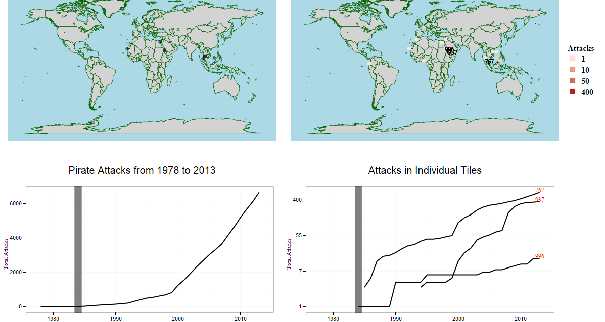
The updated code is below the screenshot. Click the screenshot to see a live example.
# points on world map
a_world <- ggplot() +
  geom_polygon(aes(long, lat, group = group), size = I(1),
               data = countries, fill = "lightgrey", colour = "darkgreen") +
  geom_point(aes(coords.x1, coords.x2, showSelected = year),
             size = 3, alpha = I(.5), data = pirates) +
  make_text(pirates, 0, 90, "year", "Pirate Attacks in %d") +
  theme(panel.background = element_rect(fill = "lightblue"),
        axis.line=element_blank(), axis.text=element_blank(),
        axis.ticks=element_blank(), axis.title=element_blank(),
        panel.grid.major=element_blank(), panel.grid.minor=element_blank()) +
  theme_animint(width = 550, height = 350)
# tiles on world map
a_tiles <- ggplot() +
  geom_polygon(aes(long, lat, group = group), size = I(1),
               data = countries, fill = "lightgrey", colour = "darkgreen") +
  geom_tile(aes(xmid, ymid, fill = log(attacks),
                showSelected = year, clickSelects = id),
            data = pirate_tiles, colour = I("red")) +
  geom_text(aes(xmid, ymid, label = id, showSelected = id),
            data = pirate_tiles) +
  make_text(pirates, 0, 90, "year", "Pirate Attacks from 1978 to %d") +
  scale_fill_gradient(low = "#fee5d9", high = "#a50f15", name = "Attacks",
                      labels = c(1, 10, 50, 400),
                      breaks = log(c(1, 10, 50, 400))) +
  theme(panel.background = element_rect(fill = "lightblue"),
        axis.line=element_blank(), axis.text=element_blank(),
        axis.ticks=element_blank(), axis.title=element_blank(),
        panel.grid.major=element_blank(), panel.grid.minor=element_blank()) +
  theme_animint(width = 550, height = 350)
# total pirate attacks
a_time <- ggplot() +
  geom_line(aes(year, total_attacks), data = by_year) +
  make_tallrect(pirates, "year") +
  labs(y = "Total Attacks", x = "Year",
       title = "Pirate Attacks from 1978 to 2013") +
  theme_bw() +
  theme_animint(width = 550, height = 350)
# determining location of tile labels
tile_labels <- pirate_tiles %>%
  arrange(id, year) %>%
  group_by(id) %>%
  filter(attacks > 0) %>%
  summarise(text_loc_x = last(year),
            text_loc_y = last(log(attacks)))
# total pirate attacks by tile
a_tile_time <- ggplot() +
  make_tallrect(pirates, "year") +
  geom_line(aes(year, log(attacks), group = id,
                clickSelects = id, showSelected = id),
            data = pirate_tiles) +
  geom_text(aes(text_loc_x, text_loc_y, label = id,
                clickSelects = id, showSelected = id),
            colour = "red", data = tile_labels) +
  scale_y_continuous(labels = c(1, 7, 55, 400), name = "Total Attacks") +
  xlab("Year") +
  theme_bw() +
  theme_animint(height = 350, width = 550) +
  ggtitle("Attacks in Individual Tiles")
# animint visualization
viz <- list(world = a_world,
            tiles = a_tiles,
            timeSeries = a_time,
            tileTimeSeries = a_tile_time,
            time = list(variable = "year", ms = 300),
            selector.types = list(id = "multiple"),
            first = list(id = 767),
            title = "Pirate Attacks")
Thanks
This visualization did not appear overnight. It took a lot of discussion from a lot of different people. I'd like to thank Toby Dylan Hocking, Susan VanderPlas, and Carson Sievert for their help with this and for all their work in putting animint together.